Minimalist SPF 50 Packaging
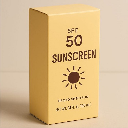
A client needed sophisticated, gender-neutral packaging for a premium sunscreen line that emphasized sun protection and product efficacy over loud branding. The objective was to create a clean, elegant design that clearly communicated the SPF 50 rating and Broad Spectrum protection using a modern, understated aesthetic.
Our Solutions
DesigningHub4U delivered a minimalist packaging solution using a soft, monochromatic butter-yellow palette and a simplified design to convey premium quality and trust. We used a clear, bold sans-serif font and focused the visual identity on a single, striking sun icon to instantly communicate the product’s purpose. This clean design prioritizes readability, ensuring the SPF rating and volume are instantly visible and appealing to a consumer seeking modern simplicity.